
Screen Resolution Simulator – Free Tool by SEO Magic Tools 
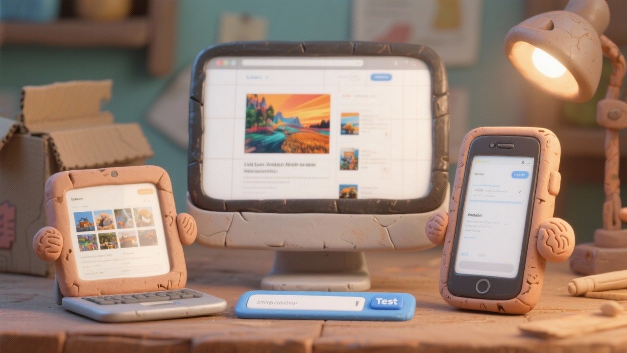
Test your website on any device instantly using our screen resolution simulator. Preview desktop, laptop, mobile, tablet, or TV screen sizes in real-time and ensure perfect responsiveness across all resolutions.

Tool Information
Screen Resolution Simulator – Test Your Website on Any Screen Size
The screen resolution simulator by SEO Magic Tools lets you preview your website across multiple devices instantly. Whether you're a designer, developer, or marketer, this tool ensures your site looks perfect on desktops, laptops, mobiles, tablets, and even 4K TVs.
Just enter the website URL, select a device resolution, and instantly see how your site loads in real-time — no coding, no extensions, and no waiting.
What Is a Screen Resolution Simulator?
A screen resolution simulator is an online tool that replicates how your website appears on different screen sizes and viewports. It allows you to check design, layout, spacing, text visibility, and responsiveness across popular devices.
With this tool, you can test multiple resolutions such as:
-
1920×1080 (desktop)
-
1366×768 (laptop)
-
iPhone & Android screens
-
4K monitor displays
-
Tablet & TV resolutions
This gives you a real-world preview of how users experience your site.
Why Use a Screen Resolution Simulator?
Websites can break, distort, or misalign across screens. This tool helps you:
✅ Identify layout issues
✅ Fix mobile-responsive bugs
✅ Check button spacing & text alignment
✅ Improve UX on every screen size
✅ Optimize landing pages for conversions
Instead of testing devices manually, you can preview everything instantly in one place.
Key Features of the Screen Resolution Simulator
✅ Real device viewports (desktop, mobile, tablet, TV)
✅ Accurate pixel-based rendering
✅ Instant URL loading
✅ Portrait & landscape mode
✅ Custom resolution input
✅ No installation required
✅ 100% privacy-first
✅ Free and unlimited usage
✅ Smooth UI for beginners & professionals
Benefits of Using This Free Screen Resolution Simulator
This tool helps you:
-
Improve mobile-first performance
-
Test responsive layouts
-
Validate CSS & UI elements
-
Compare designs across devices
-
Perfect landing pages for ads & SEO
-
Deliver professional client previews
Web designers, developers, agencies, and marketers rely on this tool for accurate, device-specific previews.
F.A.Q (5)
Pros and Cons
Pros
- Instant responsive previews
- Accurate device resolutions
- Free and unlimited usage
- No extensions required
- Supports desktop
- mobile
- tablet
- and TV
- Privacy-safe with no data storage
Cons
- Cannot edit or annotate previews
- Loads one device resolution at a time
- Very long pages may take extra seconds
- No screenshot download by default
- Not a replacement for real device testing
Reviews
You must be logged in to submit a review.
No reviews yet. Be the first to review!
Overview
Author
seomagictools.in
Free PlanPromote

Share this Tool
Similar Tools
Check if your website uses GZIP compression with this free online tool by SEO Magic Tools. Instantly analyze whether your server is compressing HTML, CSS, and JavaScript files to improve page speed, SEO rankings, and Core Web Vitals. Fast, accurate, and privacy-first — no signup or installation required.
2025-11-07
Free
Test your website on any device instantly using our screen resolution simulator. Preview desktop, laptop, mobile, tablet, or TV screen sizes in real-time and ensure perfect responsiveness across all resolutions.
2025-11-09
Free
Analyze your website’s SEO performance instantly with our free Website SEO Score Checker. Get a detailed audit report on speed, backlinks, keywords, and technical SEO factors. Improve rankings, fix issues, and optimize your website effortlessly — powered by SEO Magic Tools.
2025-11-06
Free